Telemetry mapping
Connect CI, CD, incident, and ticket sources into a coherent model before you design a single widget.
DevStream Center
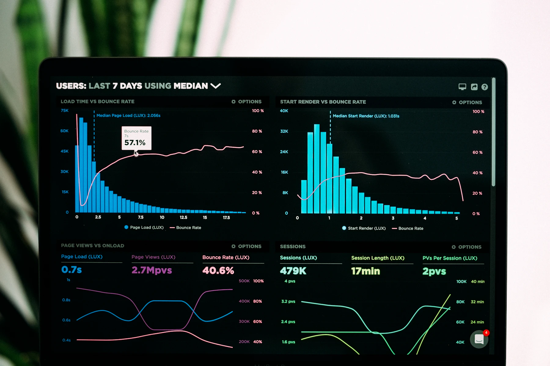
Train your team to build a Data Visualization and Analytics Platform for DevOps Delivery Analytics — from raw pipeline signals to board-ready narratives.

Featured program
Our flagship course walks platform and DevOps leads through a complete visual analytics stack: metric selection, modeling, chart grammar, and executive storytelling for flow, quality, and reliability.
Learn which pipeline and backlog events deserve a chart — and which only clutter the wall.
Translate cycle-time distributions for engineers, product managers, and finance without diluting the truth.
Why teams enroll
DevStream Center focuses on delivery analytics that hold up under scrutiny — not decorative heatmaps.
Connect CI, CD, incident, and ticket sources into a coherent model before you design a single widget.
Practice chart choices that reveal bottlenecks, batching, and wait states instead of celebrating throughput alone.
Embed weekly review rituals so dashboards change decisions, not just decorate a wallboard.
From the floor
The wait-time waterfall from the Flow Mapping module finally showed our product lead why “busy” sprints still missed dates. We kept the chart sparse on purpose — that restraint was the point.
I liked the executive briefing templates, though the SQL refreshers in week two felt brisk if you have been away from warehouses. Still, our incident aging view is now the first slide in monthly ops.
Upcoming programs
Talk with us about cohort timing, private workshops for Malaysian product orgs, or which program fits your stack.
Start a conversation